THE PROJECT
The Client
Ecodream is an Italian sustainable fashion brand that began as a project in 2014 and became a company in 2016. It has achieved significant milestones, such as winning the "Impresa Campus Unifi" contest in 2015 and the "Start-Up Success" grant in 2018.
In 2019, it was recognized as one of Italy's top sustainable brands and featured in the "GreenItaly 2021" report and Fashion Revolution Italia's 'Revolution Map'.
The brand focuses on eco-friendly, ethical fashion, emphasizing "slow fashion" principles to counteract fast fashion's consumerism.
Ecodream uses recycled materials to create durable, high-quality accessories and promotes vegan products to cater to animal welfare concerns.
The brand also supports circular economy practices by repurposing discarded materials and donating to non-profit projects
The Objective
My goal was to deeply evaluate the brand identity and the website of Econdream to recreate a new experience for the users.
Discovery
Wireframing
Brand Identity
User Interface
User Testing
DISCOVERY
Heuristic Evaluation Conclusions
Website Sparkly Points
-
Minimal design
-
Visible and well-positioned menu
-
Well-structured mobile version
-
Visibility of the brand's eco-friendly aspect
Website Pain Points
-
Taxonomy not always accurate
-
Very long and poorly readable copy
-
Links in the copy not easily identifiable
-
Poor accessibility of pages
-
Poorly positioned shopping cart
-
Incomplete footer
-
Important pages not highlighted
-
Limited navigability
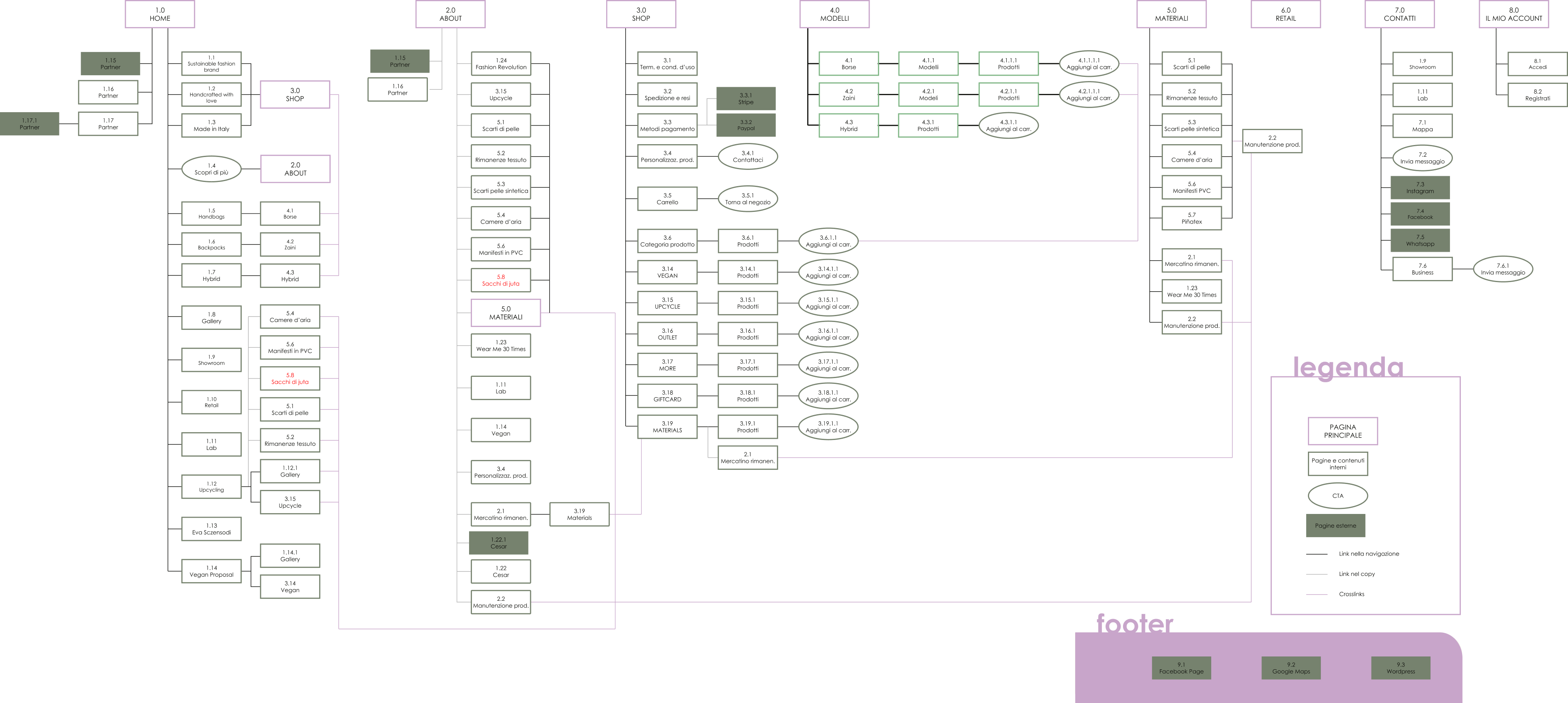
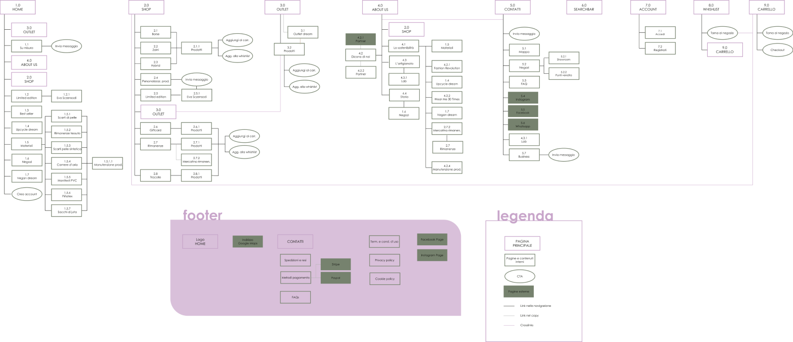
The Old Sitemap
Usability
Learnability:
The site's simple structure makes it fairly intuitive, allowing users to search for desired information easily. The purchasing process is very intuitive. However, navigation within some pages can be confusing, leading to potential navigation errors.
Efficiency:
Despite the easy-to-learn structure, efficiency remains low due to lengthy purchasing processes and often invisible links. Some pages are not indexed in the menu or are only accessible in one way, making content hard to reach. The absence of product filters increases purchase time, and the lack of a "back to top" button extends navigation time.
Memorability:
Login and registration are memorable and intuitive. However, inconsistent call-to-actions buttons in style and position lead to poor efficiency. Inconsistencies in some sections may confuse users. Excessively long copy prevents users from remembering information or content locations.
Errors:
The site implements various error messages to help users understand and remedy issues. However, inaccurate taxonomy may lead users to wrong pages. Links within copy are not sufficiently differentiated, causing users to miss them or click accidentally while scrolling. The absence of breadcrumbs prevents easy return to previous pages.
Satisfaction:
The site's minimal design enhances navigation enjoyment, but navigation issues prevent a smooth and pleasant user experience. Long processes for certain actions can create frustration. The oversized logo makes page viewing less aesthetically pleasing.
Accessibility
Ecodream website faces several accessibility issues:
-
Texts use a font that is too thin, making them hard to read
-
Links are not easily distinguishable from the rest of the text
-
Not all pages are indexed, and some are only accessible via the "About" page link
-
The content taxonomy is often confusing
-
Buttons are large enough but inconsistent in position and style across pages, and some lack sufficient contrast with the background
-
Images lack Alt Text for accessibility
-
The site's images and social media content are not inclusive, featuring only one type of customer model
Survey Conclusions
-
Target audience prefers physical stores over online shopping.
-
When shopping online, PC is preferred, but smartphones are also widely used.
-
Offers/outlet sections are the first visited in e-commerce, followed by direct shop browsing.
-
Common practices include creating wishlists and comparing products before purchasing.
-
Brand sustainability and work ethics are highly valued.
-
Word-of-mouth, social media (especially Instagram), and Google are primary sources for brand discovery.
-
Price, quality/durability, and reviews are crucial factors in purchasing decisions.
-
Most participants don't share products with friends before buying, but a significant number do.
-
Majority willing to spend €50-€100 on sustainable, ethical, artisanal, Made in Italy bags/backpacks. Some would spend up to €200.
-
Almost all users check reviews before purchasing.
-
Preferred shipping cost is under €5, with some willing to pay up to €15.
-
Website aesthetics are very important to most participants.
-
Survey demographics: 66.7% women, 33.3% men, mostly aged 20-30, followed by 31-40.
Opportunities:
-
Consider free returns and low-cost/free shipping.
-
Improve desktop version of the e-commerce site.
-
Highlight the outlet section.
-
Implement wishlist and product comparison features.
-
Restructure the 'About' section for better accessibility.
-
Add shop filters and a search bar in the menu.
-
Develop marketing strategies: Instagram campaign, Google Ads, and word-of-mouth promotion.
-
Implement a product and service review system.
-
Add social sharing buttons for products.
-
Personalize the website to make it less generic and more aesthetically pleasing.
The New Sitemap
Home:
The order of sections has been changed to give more prominence to the outlet and product customization.
Shop:
Product organization has been updated to allow direct access to products from the shop. Users can now select models later using filters, providing a comprehensive view of available products while maintaining the option to filter by model.
About Us:
The page has been renamed from "About" to "About Us" for a more personal and engaging feel. The sections have been reorganized for easier reading, with internal sections renamed to focus on sustainability, craftsmanship, and the brand's history, allowing for easier navigation without excessive scrolling.
Materials:
The materials page has been removed from the menu bar and can now be found on the home page, within the sustainability section of the "About Us" page, or via the search bar.
Footer:
The footer has been simplified to include only essential information: a link to the home page via the logo, an address linked to Google Maps, support, legal area, and social links, providing a more appropriate position for these pages without overloading the footer.
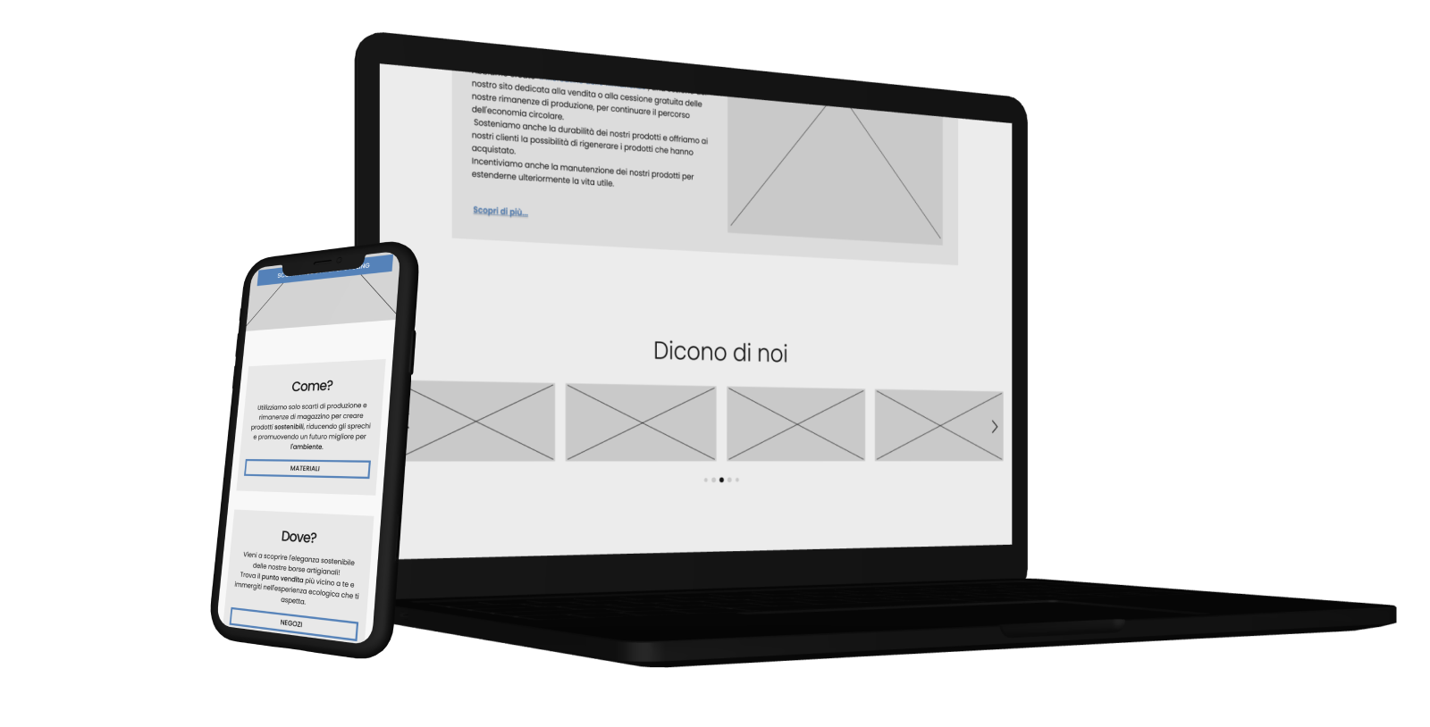
WIREFRAMING
BRAND IDENTITY
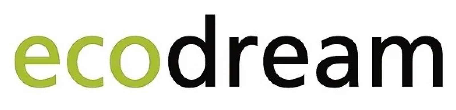
The Old Logo
The previous logo was clearly outdated and it was in need of a refresh.
The New Logo
To enhance the brand's elegance, I have decided to redesign the logo. This change allows it to better align with both the color palette and the new brand identity.
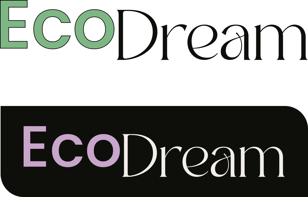
Color Palette
The current EcoDream website lacks a consistent color palette, resulting in colors that are not harmonious.
Texts often lack adequate contrast.
For the website redesign, I ensured that each color's contrast level was checked to make the pages accessible, with clear and readable text for everyone.
The color palette is composed of:
LILAC
Hex: #C8A5CA
Rgb: 200, 165, 202
ALOE
Hex: #7FB685
Rgb: 127, 182, 133
HUNTER
Hex: #0E0F0B
Rgb: 14, 15, 11
ISABELLINE
Hex: #F2EEE9
Rgb: 242, 238, 233
Typefaces
To maintain consistency through the project I decided to look for elegant typefaces.
I selected the following typefaces:
-
Badoga
-
Poppins
The usage of these typefaces - and their relative fonts - is very specific.
Badoga is used for the logo type.
Poppins is used for bodycopy and headings.
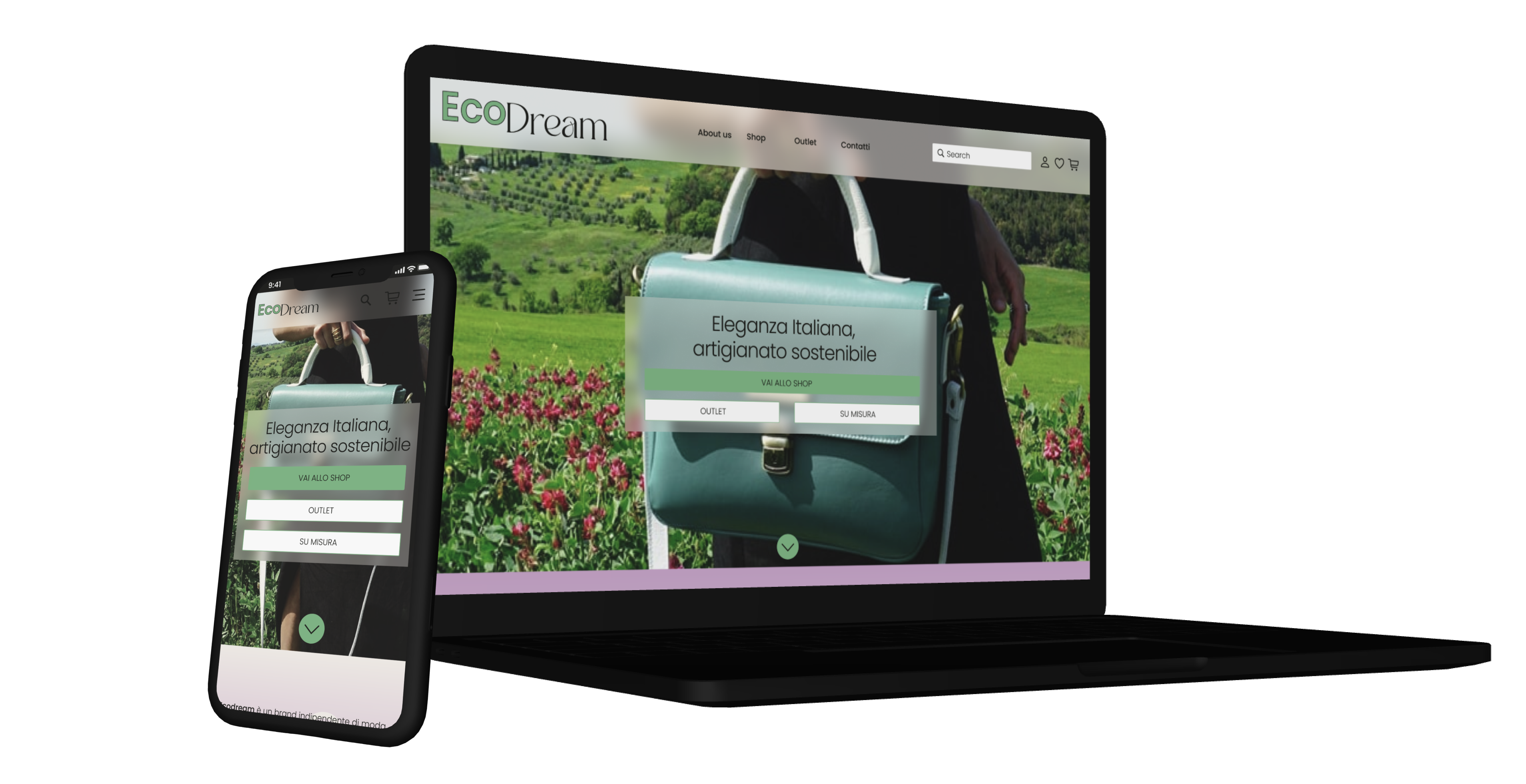
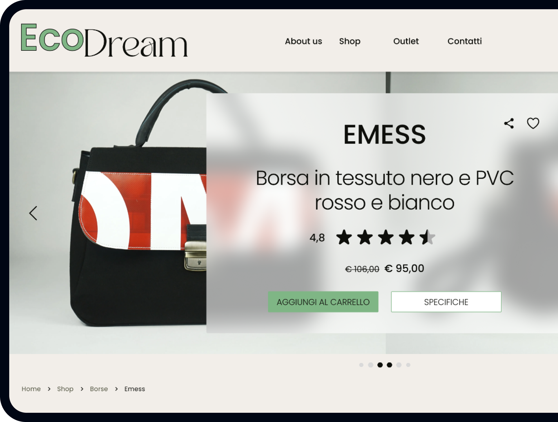
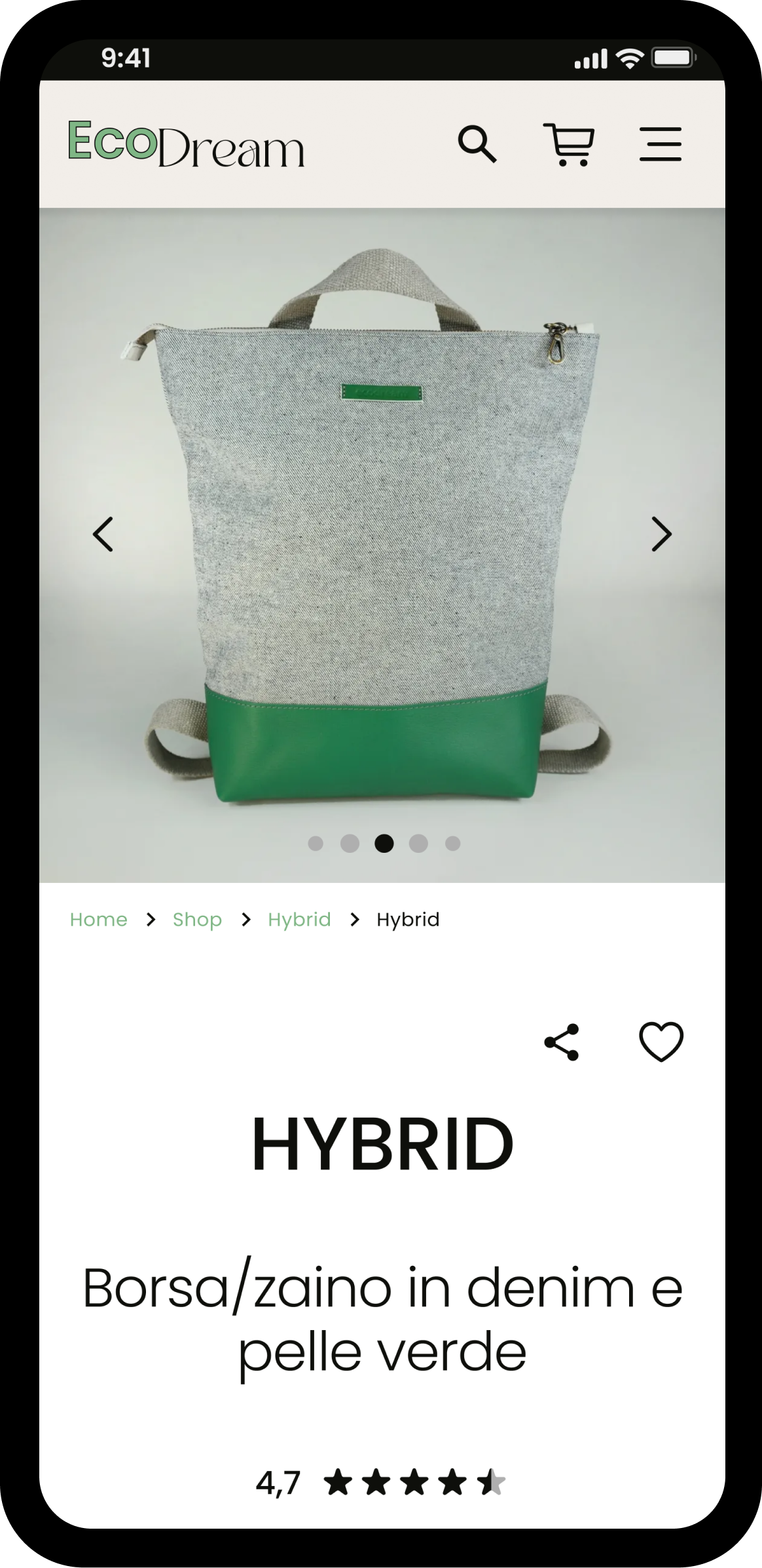
USER INTERFACE
The Components
The border radius created during the wireframing phase has been eliminated, making way for more modern components with sharp corners.
For outline components, a 1px border has been used.
Colors from the created palette have been consistently assigned to each component throughout the site.
Components have been animated for state changes and page transitions to create a pleasant effect during site navigation.
Component states are identified by color and shadows.
Mobile Version
Figma
Desktop Version
Figma
USER TESTING
Objectives
After creating the UI, I questioned the usability and intuitiveness of the website.
To address this, it's necessary to involve users to test the prototype and identify any potential pain points.
Additionally, I want to ensure that the new brand identity aligns with Ecodream's message.
Methodology
Considering the research objective, the most suitable methodology is usability testing. Usability testing allows for the evaluation of a product's usability with real users.
I've chosen to use the moderated type, as it enhances research opportunities by enabling communication with the user regarding the reasons behind their choices and the feelings experienced during the product interaction.
Changes Applied
Style
I have updated the buttons design, adjusting their border radius to achieve a more harmonious and pleasing appearance.
In response to feedback from two out of three testers, I have also modified and enhanced the images, as they were perceived as slightly opaque and not very appealing.
Additionally, I have implemented a brief animation for the scroll button to improve its visibility. This decision was made in response to feedback from one of the testers who felt that the scroll function was not immediately apparent.
This solution has also introduced the purple color above the fold, allowing the page to be more consistent with the colors below the fold, as pointed out by one of the testers.
Layout
Regarding the layout, users have greatly appreciated the prototype ad were able to use it seamlessly. The only modifications involve the positioning of the "About Us" section in the menu and the placement of the "Go to Shop" CTA above the fold.
This is a short version or my project. If you’d like to know more about my design process go to the full version
Figma - Italian