THE PROJECT
The Client
"Block al cubo" is an association that offers a bouldering room specifically designed to promote both training and education, for all ages.
Its goal is to create a gathering place where people can meet and organize outdoor climbing sessions.
The Objective
My goal was to deeply evaluate the brand identity and the website of Block3 to recreate a new experience for the users.
Brand Identity
Discovery
Wireframing
User Interface
User Testing
BRAND IDENTITY
The Old Logo
The previous logo of Block3 accurately represented the type of service offered but was clearly outdated. While it closely matched the brand identity, it was in need of a refresh.
First of all it’s too elaborated, this makes it not easily memorable nor scalable.
Secondly, even if the objective of the brand is clear here, their logo does not give emotions nor feelings.
Moreover Block3 does not have a payoff and, let’s be honest, us climbers need some encouragement once in a while!
To develop a new brand identity I will create:
-
a new logo
-
a new payoff
-
a new color palette
-
new typefaces
-
new icons & illustrations
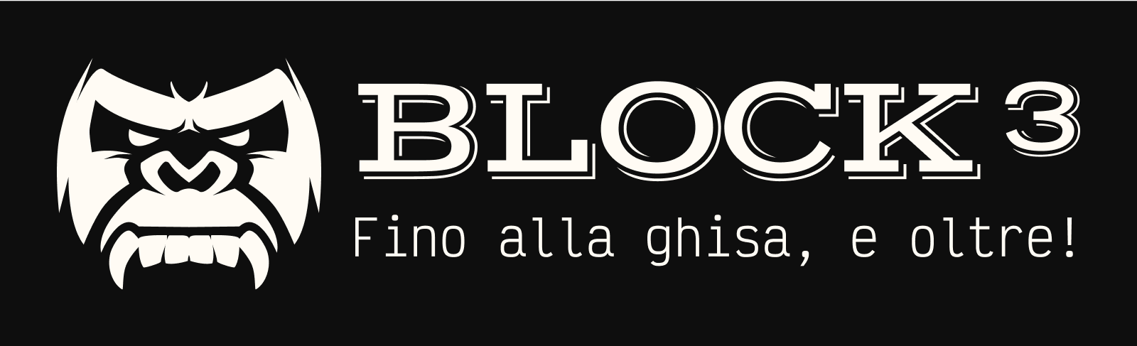
The New Logo
The new logo is developed with a minimalist approach, the image is simple and outlined.
The figure is highly memorable and strong.
To develop this logo I decide not to refer to a direct reference (like the old logo did), but to focus on feelings and sensations that climbing - and specifically bouldering - gives.
The Payoff
“Fino alla ghisa, e oltre!”
Literally translated in “until iron, and beyond”, this payoff refers to an unpleasant sensation that appears after a long climbing session.
It’s a painful sensation that makes your forearms feel bigger and hard like iron after a long stress of your fingers on the holds.
“Fino alla ghisa, e oltre” is an encouraging payoff that pushes to go beyond your pain and limits to reach the top!
Color Palette
It was not easy to find a brand identity that adapt to the new logo without being trivial.
I didn’t want the power of the logo to compensate a pale color palette.
That’s why I went for a brutalist color palette, characterized by strong bright complementary colors.
The color palette is composed of:
LIME GREEN
Hex: #26D122
Rgb: 38, 209, 34
PIGMENT GREEN
Hex: #179D34
Rgb: 23, 157, 52
AEROSPACE ORANGE
Hex: #FF4D00
Rgb: 255, 77, 0
VERONICA
Hex: #9747FF
Rgb: 151, 71, 255
Typefaces
To maintain consistency through the project I decided to look for brutalist typefaces.
This way the style of the palette will be reflected in the typefaces too, giving a strong identity to the brand.
I selected 3 typefaces:
-
Victor Mono
-
Vast Shadow
-
Inter
The usage of these typefaces - and their relative fonts - is very specific.
Victor Mono is used for headings, payoff, and important text.
Inter is used for bodycopy.
Vast Shadow is exclusively for the logotype and short primary text; in fact, its display nature makes it appropriate just for these situations.
DISCOVERY
Heuristic Evaluation Conclusions
Website Sparkly Points
-
Minimal design
-
Simple information architecture
-
Brief and straight to point text
-
Elements consistency
Website Pain Points
-
Dated design
-
Poor responsiveness
-
Unusual element positioning
-
Contact form missing
-
Not properly managed links
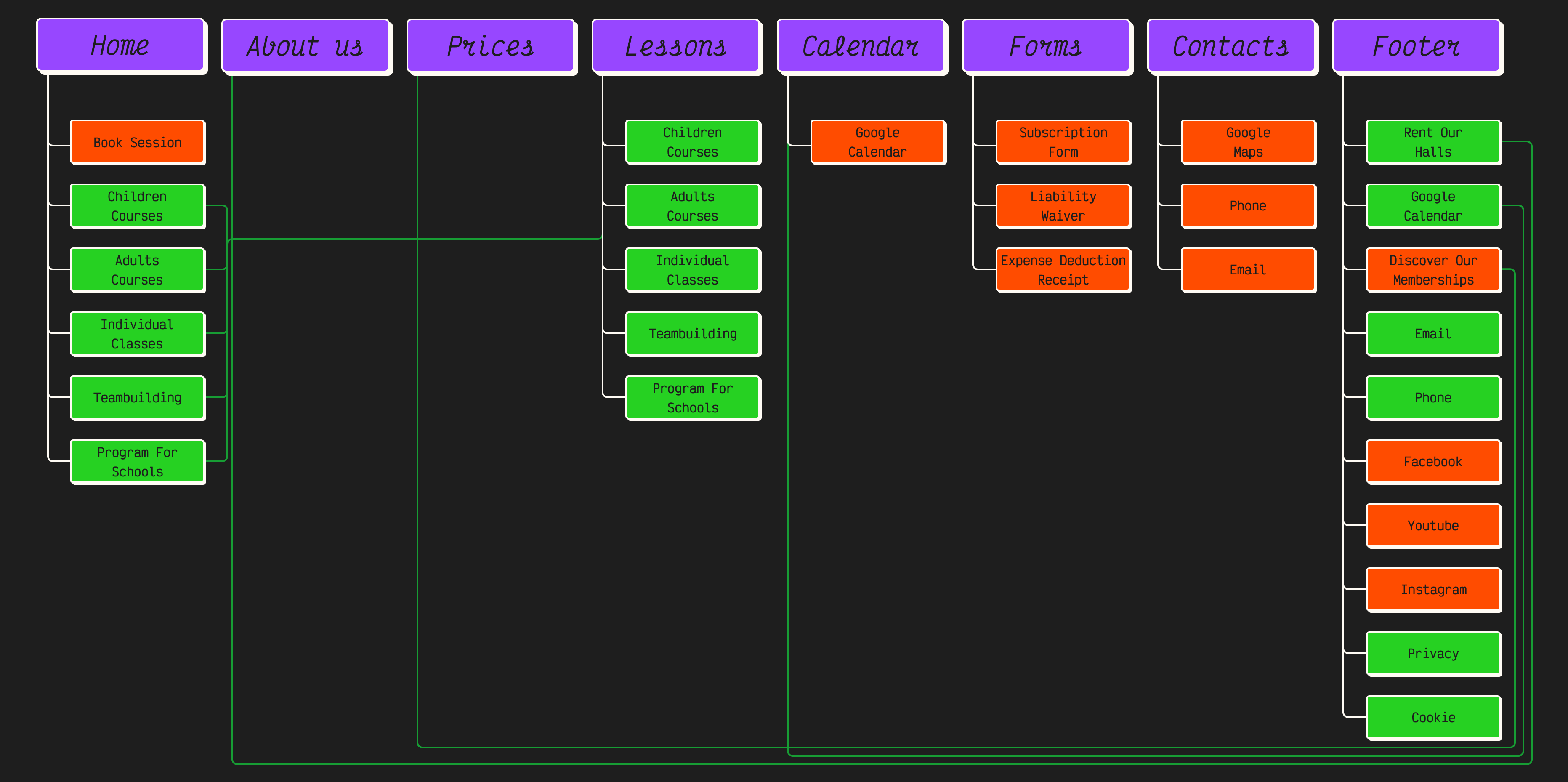
The Old Sitemap
The Information architecture of Block3’s website is pretty simple and consequently intuitive.
Interactions are limited and a lot of links bring to external websites.
This makes the navigation tree very simple and minimal but at the same time it doesn’t allow for a flexible navigation and a brief interaction.
Hypotheses
Based on the heuristic evaluation of the website and on competitors’ websites I defined some hypotheses on the possible usability improvements that can be done on the site:
Content:
-
Indicate the possibility to rent the climbing shoes (maybe it’s given for granted but it’s better to be clear)
-
Add a page with the safety rules and general rules of the gym
-
Add a page with the terms and conditions
-
Redesign the prices table in an understandable way (also I find sexist to do a discount for women - even if I enjoy paying less - I’m torn about it)
-
Reorganize the courses page
-
Implement a review section (or maybe a Google widget, since people review activities mostly on Google)
Usability:
-
Improve links management
-
Add a link to the homepage in the footer
-
Declutter and reorganize the footer
-
Add a contact form to the contacts page (at least)
-
Make the menu bar sticky to the top of the page
-
Differentiate the interactive elements from the static once
-
Add some internal links and more booking CTAs
-
Improve the responsiveness
Survey Conclusions
The climbing community is a diverse one, with a significant portion falling between the ages of 25 and 44. Surprisingly, the number of climbers under 25 isn't as high as expected, but this result can be influenced by the type of channels used to share the survey.
Gender-wise, the climbing world is surprisingly balanced, with almost an even split between males and females. Not what we anticipated!
Smartphones reign supreme as the preferred device for internet access. Users are accustomed to spending 2-3 hours online daily, emphasizing the importance of a user-friendly website.
Most climbers are committed, hitting the gym more than twice a week (it’s not a low maintenance passion!).
They might not frequent climbing gym websites, but we can change that by implementing tester-suggested features and resolving issues highlighted by the heuristic evaluation.
Search engines are where climbers hunt for gym information, indicating a potential for improved positioning and Google Ads.
Location, prices, and route quality/variety are paramount when choosing a climbing gym. Highlighting these aspects can attract the right crowd and make the website more intuitive.
Booking sessions and limited entry might seem like revenue constraints, but they're long-term investments, since busyness is a major gym turnoff.
At the top of the motivations to leave a gym is bad maintenance/management, so ensure top-notch handling and promote it on social media is a big advantage.
Our target users value website content as much as its visual appeal. Quality images are a must, along with route resetting schedules, current capacity, available equipment, and event listings, which are often missing on gym websites but highly appreciated.
A vibrant social media presence is key. Here the Block3 management shines, consistently providing engaging content and maintaining their pages with the same dedication they show in their gym.
After the survey I asked some gym members about the fact of having a discount policy for women and a high percentage of them did not found the fact offensive or sexist so I decided to keep the discount in the redesign too.
So let’s now make their website better by incorporating these vital features!
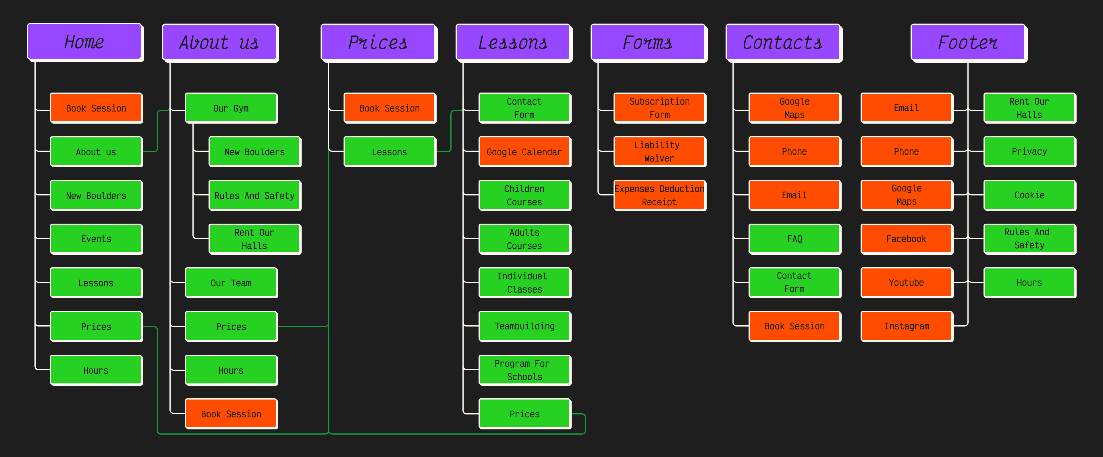
The New Sitemap
WIREFRAMING
USER INTERFACE
The Style Choiches
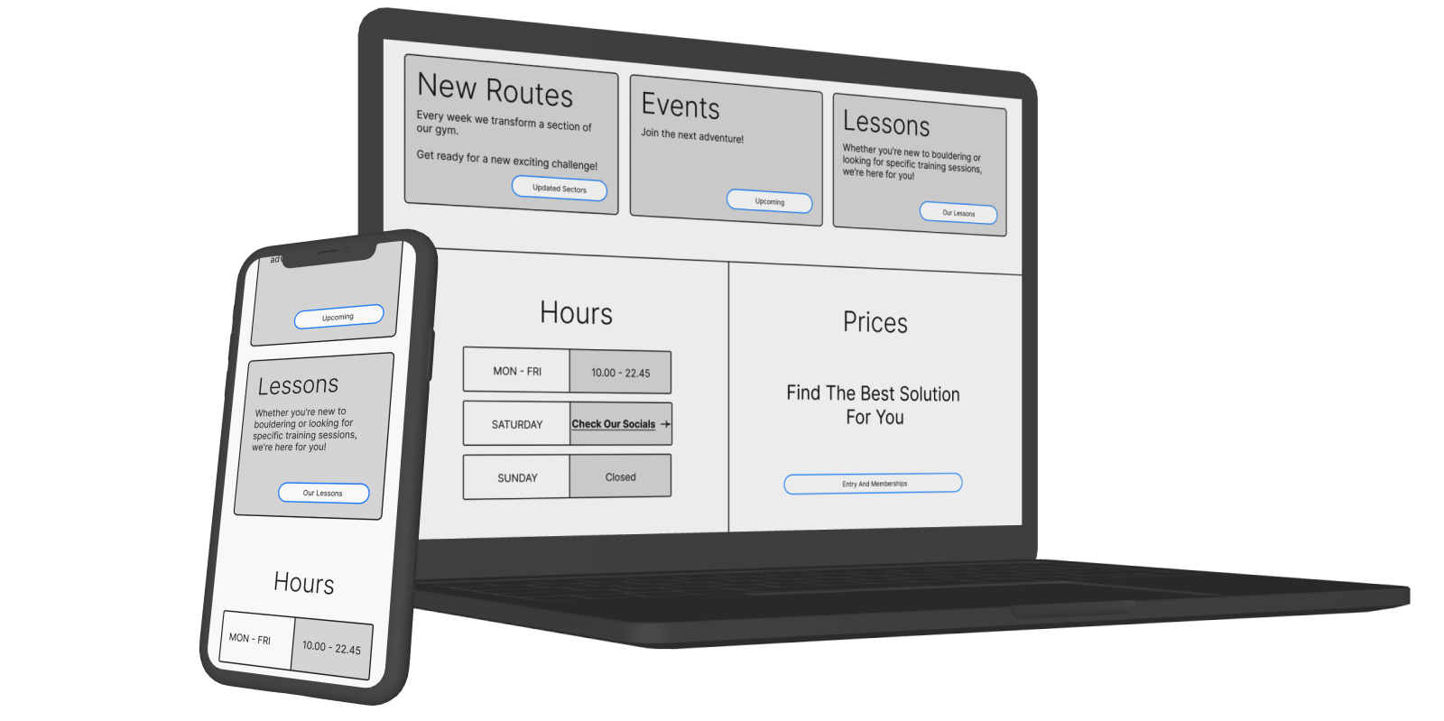
Block3's website features a neo-brutalist style with bright colors and bold text that create a strong impact.
This design captures the playful yet powerful feeling of bouldering in the gym. As you explore the site, you experience the thrill and energy of the sport, making it a memorable visit.
The animated elements on the site add to its dynamic feel, making it lively and engaging.
Overall, the website reflects the vibrant essence of Block3, ensuring an active and fun experience for users.
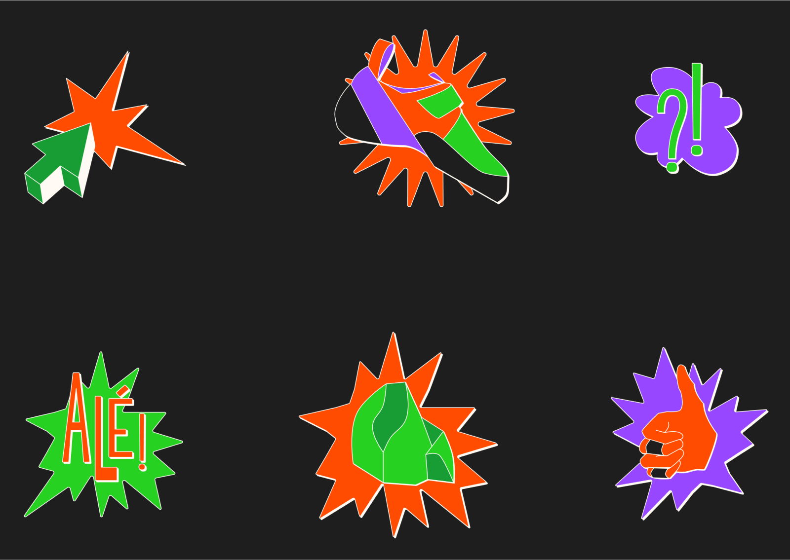
Illustrations
Mobile Version
Figma
Desktop Version
Figma
USER TESTING
Objectives
After creating the UI, I questioned the usability and intuitiveness of the website.
To address this, it's necessary to involve users to test the prototype and identify any potential pain points.
Additionally, I want to ensure that the new brand identity aligns with Block3's message.
Methodology
Considering the research objective, the most suitable methodology is usability testing. Usability testing allows for the evaluation of a product's usability with real users.
I've chosen to use the moderated type, as it enhances research opportunities by enabling communication with the user regarding the reasons behind their choices and the feelings experienced during the product interaction.
Changes Applied
Layout
-
The contacts page was renamed as Contacts & FAQ. This way the FAQ section is more discoverable.
-
In the same page, right after the FAQ section, a booking CTA was added to the layout. This solution allows for a easier and faster booking process.
Style
-
The gym logo used as a transparent background was removed from the pages to make them more accessible and to meet the users preference.
-
The border of the illustrations has been reduced to improve the gracefulness of the website.
This is a short version or my project. If you’d like to know more about my design process go to the full version
Figma